Turn By Turn
Logo design
This is the logo I designed for the fictional board game company Turn By Turn. The idea behind this project was to create a logo that would suit a brand that focuses on board games for all ages. I wanted something that had a playful and childish feel, yet was professional and catchy enough to stand out from other brands.
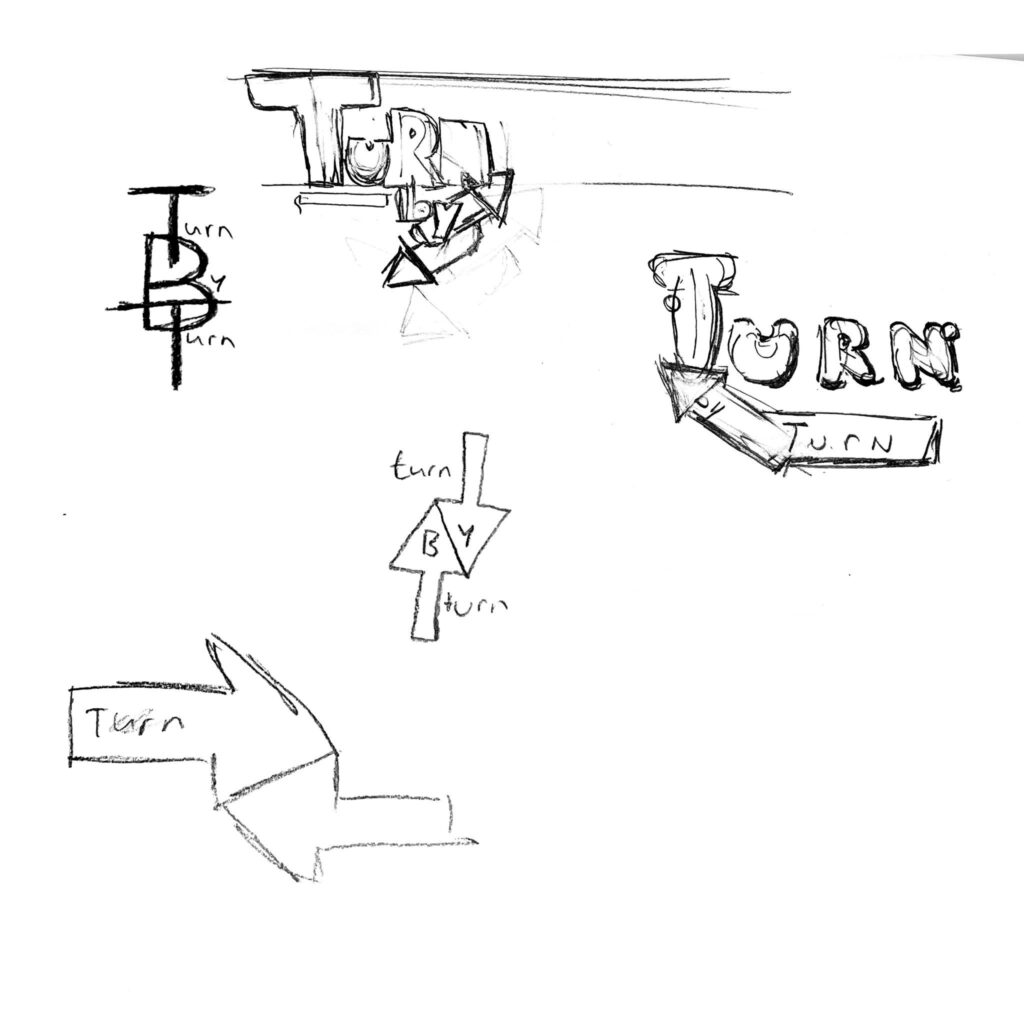
We started this project by sketching various concepts. I experimented extensively with shapes, colors, and especially fonts. Ultimately, I chose the font shown in the top left corner of my sketchbook. It appealed to me most because it has a friendly and playful feel, which fits well with the board game theme.
I also added an arrow (shown in the bottom right corner of the sketch), which refers to the idea of ”turn by turn.” This arrow makes the logo a bit more dynamic and strengthens the connection with the game element. After the main logo, I also created a smaller version that wasn’t sketched, but improvised directly digitally. This smaller version is useful for social media, for example, or as an icon on packaging.
My team really liked the final result and were pleased with how well the logo conveyed the brand’s atmosphere. I found it a fantastic project to work on, especially because I had a lot of creative freedom and could really experiment with style and form.
Corporate identity
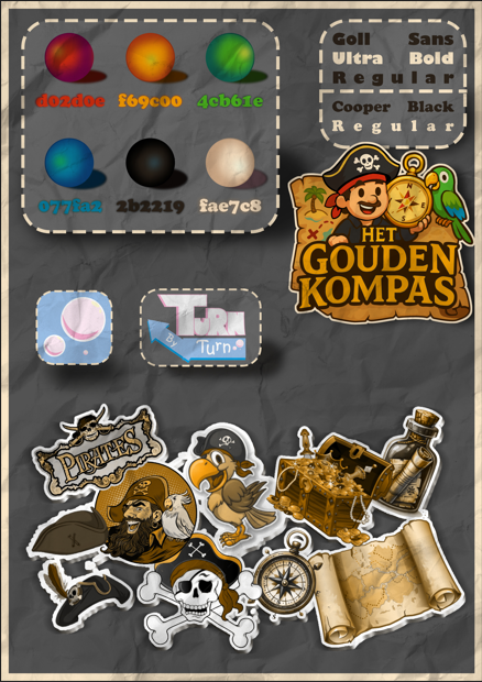
For the corporate identity of Turn By Turn, a fictional board game about shipping, I started by gathering ideas for the logo and the overall brand image. My first step was creating a mood board. This allowed me to gather inspiration around themes like adventure, water, nautical elements, and playfulness all elements that fit well with a board game set in the world of shipping.
While designing the logo, I initially worked with preliminary colors, taking them directly from the logo, which was still in development at the time. To experiment with the atmosphere and style, I used Photoshop to make the colors truly shine.

I used several layers to create depth and dimension: a multiply layer to add shadows and an add layer for highlights, especially for the circles in the design. This gives everything a slightly more realistic and vibrant look.
I also added color codes to ensure consistency in style and placed borders to neatly define everything. I also incorporated both versions of the Turn By Turn logo into the design the original and the scaled-down version and added additional elements like shadows and fonts that fit the theme.
As a finishing touch, I applied a paper texture. This makes everything feel a bit more authentic and tactile, as if you’re looking at a real game manual or box art. This completed the branding, and I’m very pleased with how everything comes together as a cohesive whole.
Kaarten
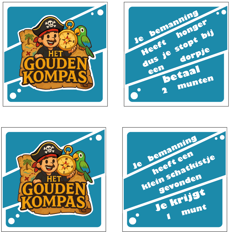
I first created simple card designs to check for balance and how the cards interacted during play. After that, I developed them further. This is how they turned out.